
How To Redesign Your Website With Purpose And Intention

The marriage proposal (although hoped for) was a complete surprise when it happened. Now with a ring on it to stand for the promise of marriage, you’re ready to run not walk down the aisle!
However, the overwhelm of planning a 3-day mega wedding feels like a second full time job and you’re running out of steam. You need help.
However, your excitement is close to flatlining with each uninspiring wedding planner site visit. Then, you stumble upon a site that immediately resonates—clear, approachable, and speaking directly to you like a trusted friend. It promises a stress-free wedding journey that reflects your unique love story.
That website had recently undergone a redesign guided by the StoryBrand framework and Squarespace, turning it into a powerful tool for conversions.
For small business owners struggling to make their websites connect with their audience and drive results, this case study reveals how a thoughtful redesign can make all the difference.
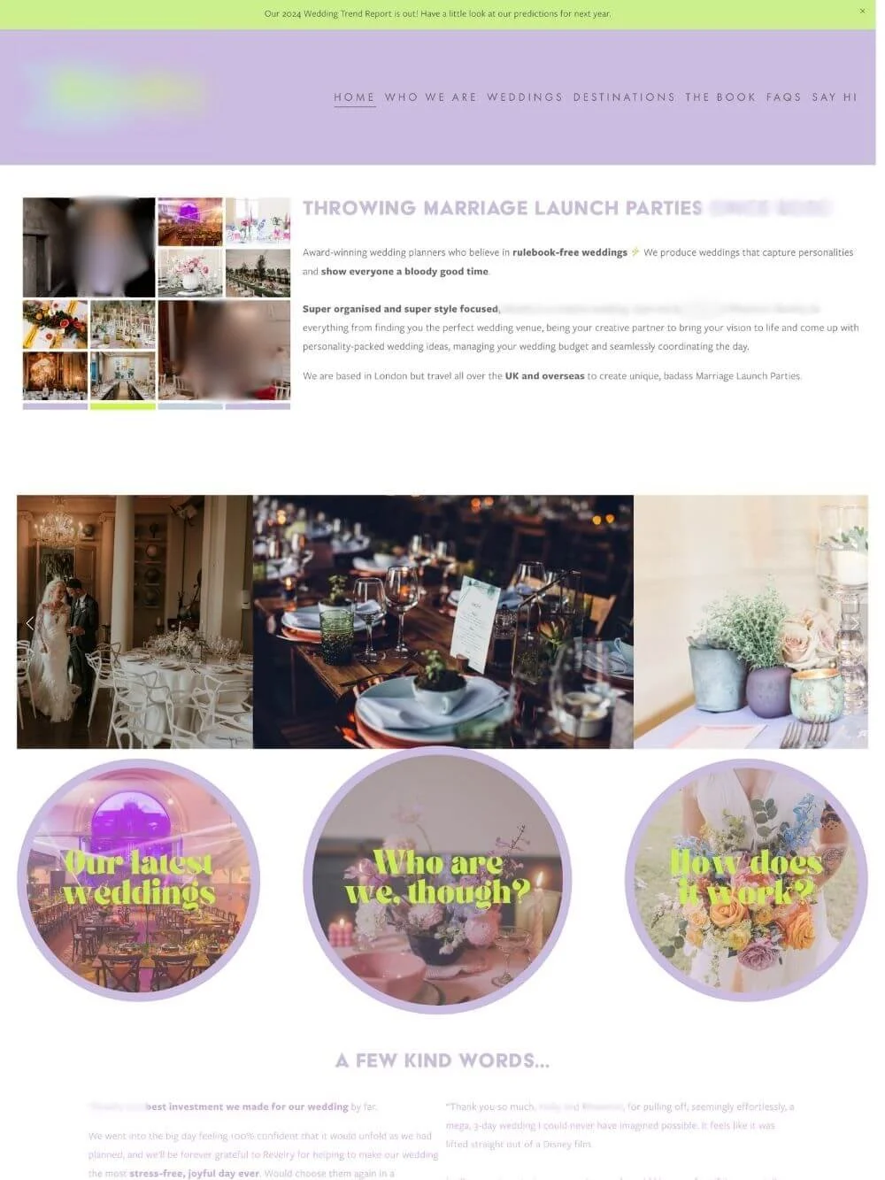
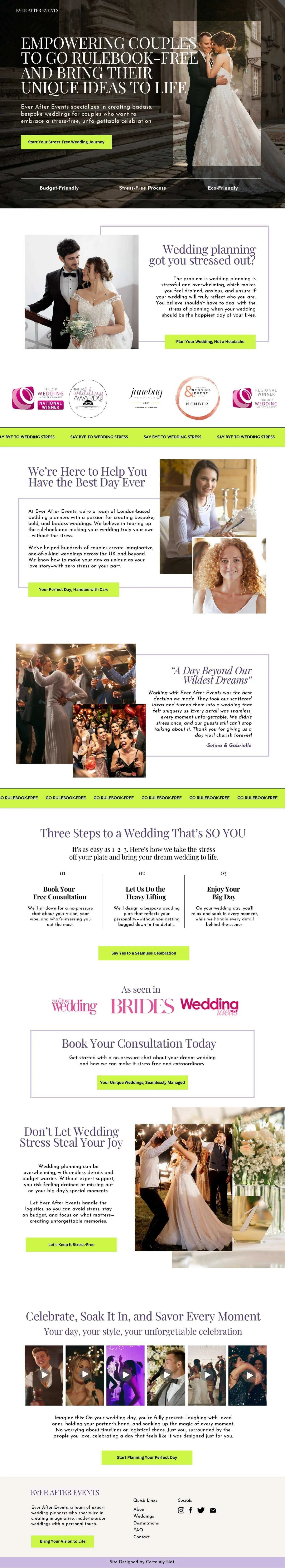
Original Website
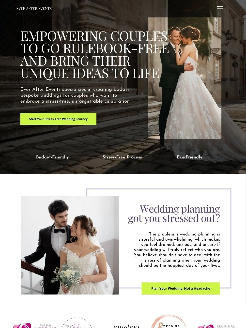
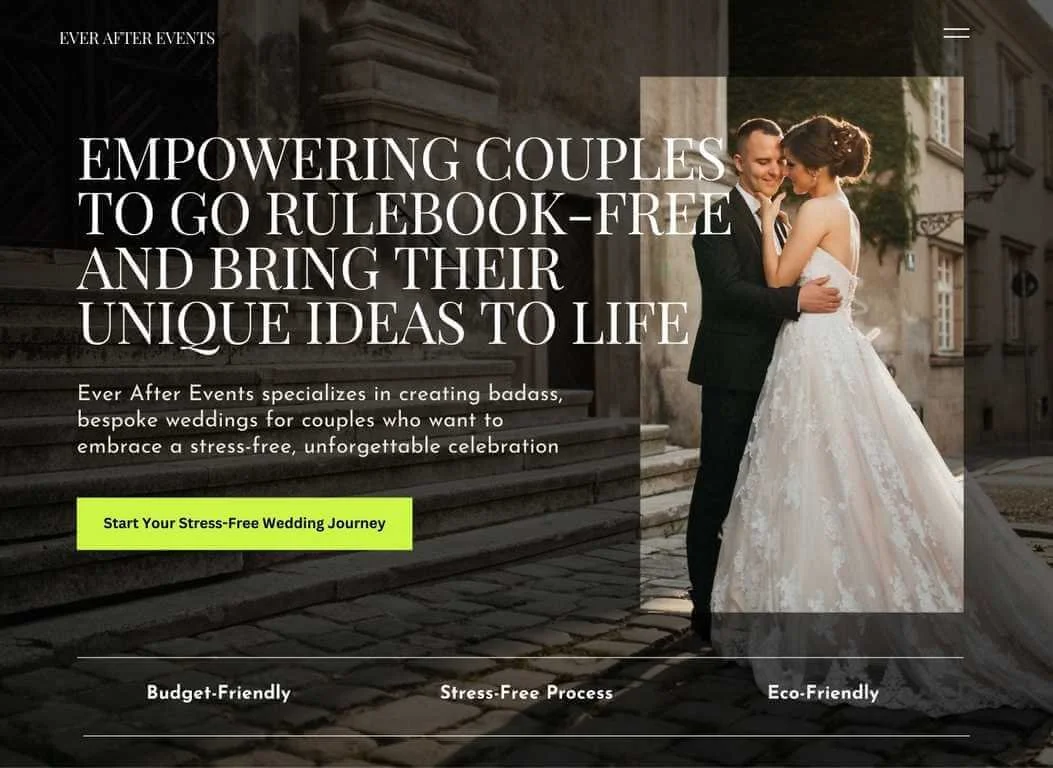
Redesigned Website
The Challenges: Missing the Mark on Connection and Relationship
The original wedding planner's website suffered from issues that are all too common:
Unclear Messaging: The original site fails to clearly articulate its value proposition, leaving visitors unsure if it could meet their needs.
Poor Visual Appeal: Generic imagery and uninspiring design elements made the site forgettable.
No Calls to Action (CTAs): Without clear guidance, potential clients didn’t know what steps to take next.
Studies show that 94% of first impressions are based on a website's design, and users form opinions within 0.05 seconds. The original design failed to make a positive impact, likely causing visitors to bounce before exploring further.
As the CEO of your small business, it’s essential that your website communicates both visually and through clear information why potential clients should choose your services. A compelling online presence not only showcases your value but also builds trust and sets you apart from competitors.
The Solution: A StoryBrand Approach
The redesign embraced the StoryBrand framework, a powerful methodology designed to position the customer as the hero of the story while making the business the trusted guide. Here’s how the framework shaped the transformation:
1. A Clear and Compelling Hero Section
The digital landscape is constantly shifting and changing. What worked in the past continues to evolve and change as people are inspired by, and discovering new things. One of the worst and most damaging mistakes that occur over and over again is simply missing the point of the hero section.
The new hero section clarifies and addresses the point by answering four key questions straight out the gate in, order to stay ahead in messaging. It emphasizes:
Who do you help? Couples planning their weddings.
How do you help them? Empowering them to go “rulebook free.”
What’s the benefit? Bringing their unique ideas to life.
What’s the next step? Starting their stress-free wedding journey.
If you confuse your potential client at the top of your homepage (by being vague, using technical language, cliched, keyword stuffing or making the hero section all about you) you will also lose them here.
Clear beats clever, and this simplified messaging is front and center, aligning with research that visitors need clarity within 10 seconds to stay engaged.
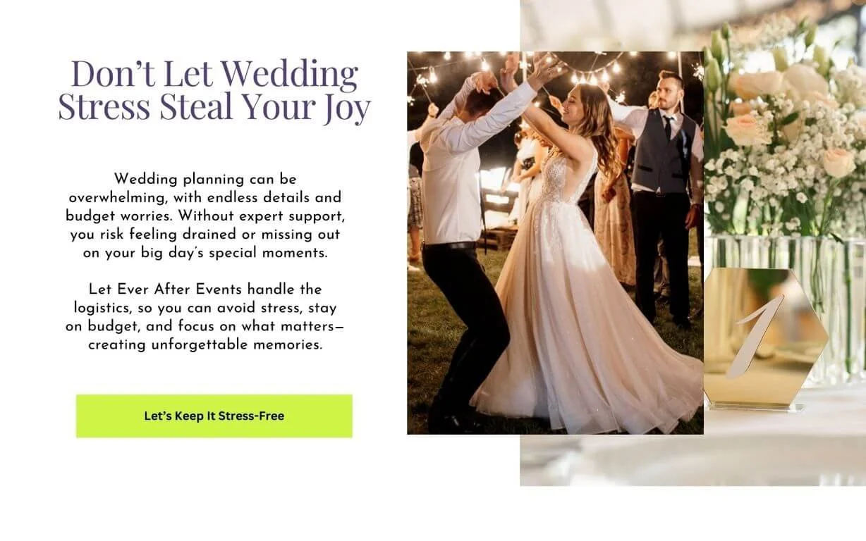
2. Empowering and Relatable Visuals
People connect with people, and people buy from people. It’s that simple! The redesigned website emphasized this by featuring visuals of couples in the moment, mirroring the authenticity of their wedding day.
The new images show real moments and sincere emotions captured in time. Images that look and feel natural and authentic will always resonate better with audiences.
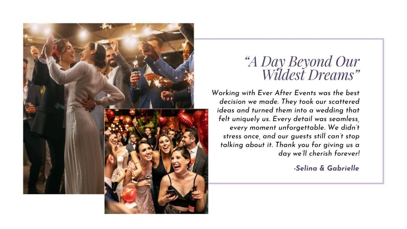
This replaced the original website’s focus on static images of table settings and floral arrangements.
The new relatable, joyful visuals help potential clients picture themselves experiencing their “happily ever after.” By fostering an emotional connection, the redesign underscored the promise of a fun, personalized, and meaningful wedding planning experience.
3. Accessibility and Inclusivity
Accessibility was a priority, not an afterthought, in the Squarespace redesign, ensuring that the new website is much more accessible to a broad range of people with different abilities.
The original design featured low-contrast lilac text on a white background, resulting in a contrast ratio of just 1.77:1—a significant barrier for individuals with visual impairments or colour blindness.
In the redesign, black text replaced the lilac, providing much higher contrast and fully complying with WCAG (Web Content Accessibility Guidelines) standards.
This change ensured that the site not only looked visually appealing but also met essential accessibility benchmarks.
To maintain the brand's identity, a richer shade of purple was used for headings, aligning with the planner’s “welcoming and accessible” ethos while offering an inclusive experience for all users.
By not being aware of design accessibility issues, small business run the risk of excluding up to 25 percent of their potential customers who experience visual impairments.
4. Prominent Calls to Action
Research shows that well-placed and action-oriented calls to action (CTAs) can boost conversions by as much as 371%.
The redesign incorporated the florescent green from the original design into bold and inviting buttons that used CTAs like “Start Your Stress-Free Wedding Journey,” and “Let’s keep it Stress Free” making it easy for visitors to take the next step.
The Results: A Website that Delivers
The transformation is intended to yield impressive outcomes:
Improved Engagement: Visitors spent more time exploring the site, reflecting their connection with its messaging and visuals.
Higher Conversions: With clear CTAs and relatable messaging, inquiries from potential clients should increase significantly.
Stronger Emotional Connection: The playful, empowering tone resonates with couples, aligning perfectly with the brand’s values.
According to Forrester Research, investing in thoughtful website design can increase conversion rates by up to 200%
Ready to upgrade your website & elevate your online presence?
A website upgrade shouldn’t feel overwhelming. That’s why our bold, story-driven Squarespace templates are built to blend beauty with strategy—so your site not only looks incredible but converts visitors into clients on any device. With streamlined customization and proven best practices, launching your dream website becomes simple, seamless, and smart.
A Website That Reflects Your Business’s Potential
Your website isn’t just an online placeholder—it’s a critical tool for growth. If your current site feels more like the “before” version of this case study, consider a redesign using Squarespace and the StoryBrand framework. A clear message and an engaging design don’t just make your site look good—they make it work for you.
What’s stopping you from transforming your website into a conversion machine?
About Your Blogger, Certainly Nat
I know how overwhelming a website redesign can feel. That’s why I tell your Brand Story using Squarespace so you have a website that reflect your brand’s success while keeping the process smooth and stress-free. With a clear, streamlined design process, I’ll help you build a stunning site that looks great and drives business growth.